

How to Read Your Solar Monitoring App
Straight answer: a monitoring app can show four things — what the panels produce, what the house uses, what goes to or comes from the grid, and the battery’s charge — but home use and grid flows appear only if a consumption meter was installed. On a clear day production draws a smooth curve that peaks around 1 p.m. in summer and noon in winter, and a south-facing system in Northridge averages about 5.7 kWh per kW of panels a day in June and 3.2 in December (PVWatts). A blank screen usually means the data link dropped, not the panels.
Get a free estimate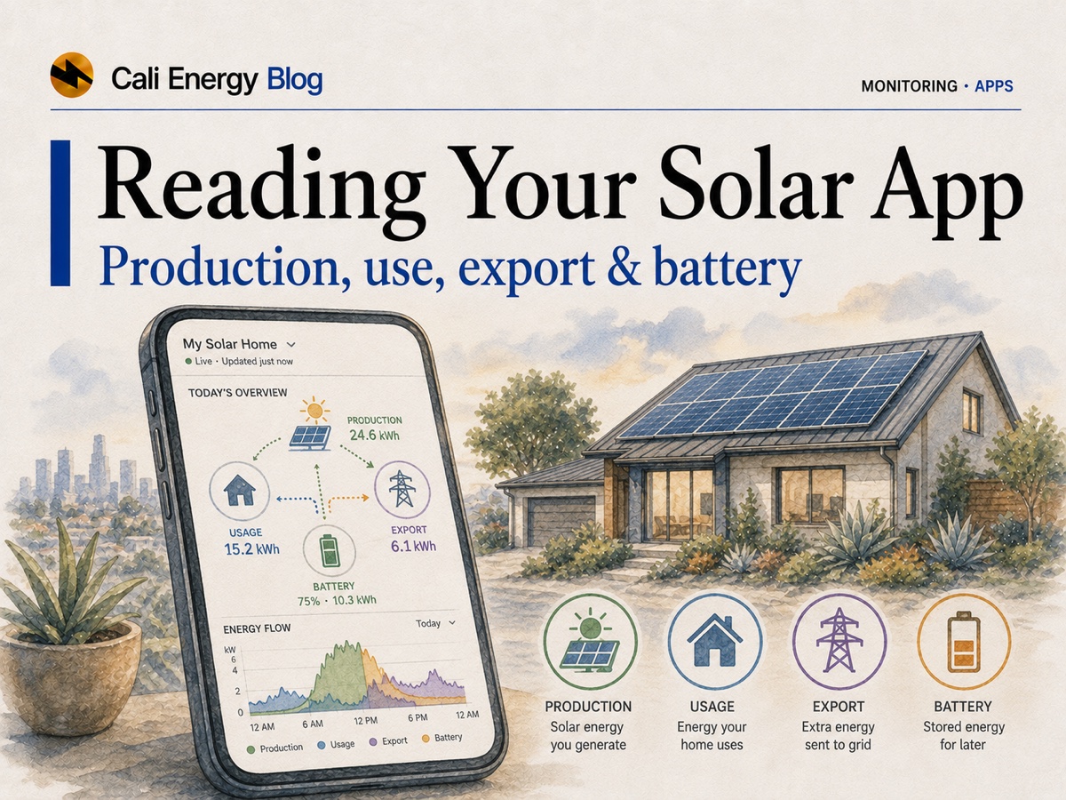
- Four numbers: production, home use, grid import and export, battery charge. Home use and grid flows need a consumption meter — on Enphase, consumption CTs on the IQ Gateway.
- Per-panel detail exists only with microinverters or DC optimizers; a string inverter reports the whole array or each string.
- A normal Valley year runs from about 3.2 kWh per kW a day in December to 5.7 in June, with May a little below April. Compare a month with the same month last year, not with summer.
- A blank app is usually a data gap: an Enphase gateway keeps storing data offline and uploads it later, about an hour per offline day.
- What the lines mean depends on the utility: on SCE an export earns a few cents while evening power costs 45–61¢, so using solar as it is made matters; on LADWP exports net against purchases at the retail price.
Four numbers, and the hardware each one needs
Every app shows production; the rest depends on what was installed.
Production
What the panels make now, in kW, and today’s total in kWh. Enphase’s gateway meters it to a revenue-grade standard, ANSI C12.20 ±0.5% (Enphase).
Home use
What the house draws at the same moment. It needs consumption metering: on Enphase, consumption CTs on the IQ Gateway, installed by a professional (Enphase).
Grid import and export
When production beats use, the surplus exports; when it falls short, the house imports. The app can only show this if it also sees home use.
Battery
With storage, the battery’s state of charge and whether it is charging from solar or discharging into the house.
Panel-level or system-level: it depends on the hardware
The app can only report what the electronics on the roof measure.
| App | Hardware | Per panel? | Notes |
|---|---|---|---|
| Enphase App | A microinverter on every panel, IQ Gateway | Yes | Panel-level production, grid imports and exports, battery; home use with consumption CTs |
| mySolarEdge | A DC power optimizer on every panel, central inverter | Yes | Panel-level monitoring, real-time production and home energy use, alerts |
| Apps for string inverters, Tesla’s among them | Panels wired in series strings to one inverter | No | Whole-system or per-string totals; one weak panel shows up only as a lower total |
Sources: Enphase App · IQ Gateway data sheet · SolarEdge for homeowners. Which architecture suits a roof is covered in Enphase vs SolarEdge.
mySunPower is now SunStrong Connect
After SunPower’s bankruptcy, SunStrong Management took over account management for about 110,000 former SunPower customers, and the mySunPower app became SunStrong Connect, available only to them; the old web portal is no longer supported. Health alerts, live production, SunVault battery control, Wi-Fi management and firmware updates are free; historical performance, panel-level data (for systems with micro-inverters built into the panels) and production-and-consumption analytics cost $9.99 a month or $99.99 a year (SunStrong Management; App Store).
What a normal day and a normal year look like
Know the shape before you judge a dip.
On a clear day production rises from near zero at dawn, peaks around solar noon and tapers to zero at dusk. For a south-facing roof in Northridge the average June peak comes around 1 p.m. daylight time at about 0.74 kW per kW of panels, and the December peak around noon at about 0.51 (NREL PVWatts). Passing clouds make the line jagged; a fully overcast day flattens it into a low bump. Both are normal.
| Month | kWh per kW of panels a day | A 6 kW system, kWh a day |
|---|---|---|
| January | 3.4 | 20 |
| February | 3.9 | 24 |
| March | 4.6 | 28 |
| April | 5.2 | 31 |
| May | 5.0 | 30 |
| June | 5.7 | 34 |
| July | 5.6 | 33 |
| August | 5.6 | 34 |
| September | 5.1 | 31 |
| October | 4.5 | 27 |
| November | 3.9 | 23 |
| December | 3.2 | 19 |
Source: NREL PVWatts, typical-year weather, standard modules, 14% system losses. A typical year, not a forecast; any one year can run a few percent above or below.
Two things in that table surprise people. December produces only about 57% of August per day, and May runs a little below April in the Valley’s typical-year data, a pattern consistent with the spring marine layer. So compare a month with the same month last year, not with summer. A gap that grows slowly every year is aging — about 0.5% a year for modules and 0.75% for whole systems (solar panel degradation); a gap that builds over a dry summer is usually dirt, which cost California systems 7.4% after 145 dry days in a UC San Diego study (solar maintenance).
Production against consumption: what it means on SCE and on LADWP
The same two lines carry different money depending on the utility.
On SCE’s Net Billing Tariff, where production sits above consumption you are exporting, and a midday export from a 2026 system earns an average of about 6¢ in summer and 3¢ in winter, plus a 1.6¢ bonus (SCE). The power you buy on TOU-D-PRIME costs 26¢ most hours and 61¢ from 4 to 9 p.m. on summer weekdays, 45¢ on winter evenings (SCE). Watching the two lines tells you when running the dishwasher, laundry, pool pump or EV charger on your own solar saves real money, and how much a battery could move into the evening; see do I need a battery and NEM 3.0 explained.
On LADWP, exports and purchases are netted kilowatt-hour for kilowatt-hour over each billing period at the retail price; on the time-of-use R-1B rate, each export is credited at its time block’s price (LADWP). On the standard tiered rate, then, when you use your solar barely changes the bill. What matters is the balance over the period: a surplus becomes a credit that LADWP never pays out, so a growing credit means the system is outproducing the house. Details in LADWP net metering.
Usually the data link, not the panels
Monitoring reports over Wi-Fi, Ethernet or a cellular link; panels and inverters keep producing without it. An Enphase gateway that loses the internet but keeps power goes on collecting data, then uploads it once reconnected, showing “Data Uploading” in the app — about an hour of upload for each day it was offline, with current data appearing after the backlog (Enphase). Worry when the app is connected and shows zero production at midday on a clear day, or an inverter fault that does not clear; then work through solar not producing.
- This week’s production against the same week last year.
- On a panel-level system, any panel that stays dark while its neighbors produce.
- Inverter or gateway status: no fault, connected.
- On SCE, how much midday solar you export and how much evening power you buy; on LADWP, the billing-period balance.
Where to go next
Cali Energy is a licensed Los Angeles solar, battery and electrical contractor (CSLB #1032379). If a curve looks wrong, send a screenshot. Call +1-323-844-7777 or ask us to look at your production.
Frequently asked
What does a solar monitoring app actually show?
Up to four things: production, the home’s consumption, grid import and export, and battery charge. Consumption and grid flows appear only with consumption metering — on Enphase, consumption CTs on the IQ Gateway, installed by a professional.
Can I see each solar panel individually in the app?
Only with panel-level electronics. Enphase microinverters and SolarEdge DC optimizers report each panel; a string inverter, Tesla’s included, reports the whole array or each string, so one weak panel shows up only as a lower total.
How much should my solar produce in Los Angeles?
For a south-facing roof in Northridge, about 5.7 kWh per kW of panels on an average June day and 3.2 in December, about 1,700 kWh per kW a year (NREL PVWatts). A 6 kW system averages about 34 kWh a day in June and 19 in December. East or west roofs, shade and dirt lower these numbers.
My monitoring app shows no data — did my solar stop working?
Usually not. Monitoring reports over Wi-Fi, Ethernet or cellular, and panels keep producing without it. An Enphase gateway keeps storing data while offline and uploads it after reconnecting, about an hour per offline day. Worry if the app is connected and shows zero at midday on a clear day, or an inverter fault that does not clear.
Does it matter when I use my solar power?
On SCE, yes: a midday export earns about 3–6¢ while evening power costs 45–61¢, so running loads on your own solar saves the difference. On LADWP’s standard rate, exports net against purchases at the retail price over the billing period, so timing barely changes the bill.
Why is my production lower this month?
Usually the season: December produces about 57% of August per day, and May runs a little below April. Compare with the same month last year. A slow yearly decline of about 0.5–0.75% is normal aging; a drop that builds over a dry summer is usually dirt.
What happened to the mySunPower app?
It is now SunStrong Connect, run by SunStrong Management for former SunPower customers. Basic monitoring and alerts are free; historical data, panel-level data and analytics cost $9.99 a month or $99.99 a year. The old web portal is no longer supported.
Related reading
Sources & methodology
Figures on this page come from the primary sources below and, where noted, from Cali Energy calculations using the stated assumptions. Rates, incentives, and program terms change; each was verified October 5, 2026.
- Enphase — Enphase App (panel-level production, grid imports and exports)
- Enphase — Homeowner updates: offline data storage and “Data Uploading” (May 10, 2024; January 30, 2025)
- Enphase — IQ Gateway data sheet (revenue-grade production metering, optional consumption monitoring)
- Enphase — Consumption Current Transformer (CT-200-SPLIT)
- SolarEdge — For homeowners: power optimizers and panel-level monitoring, mySolarEdge
- NREL PVWatts — monthly and hourly production, Northridge, 20° south roof
- SCE — Time-of-Use residential rate plans (TOU-D-PRIME)
- SCE — Solar Billing Plan (average Energy Export Credit values for 2026 systems)
- LADWP — Service Rider NEM, Net Energy Metering
- SunStrong Management — Help Center: SunStrong Connect app (formerly mySunPower), features and pricing
- App Store — SunStrong Connect (formerly mySunPower)
Not sure your system is producing right?
Send us a screenshot of your monitoring app and we’ll tell you whether that curve looks healthy — or whether it’s worth a closer look. No pressure, no sales script.
Get a free estimatePrepared by Cali Energy, October 5, 2026. This article is for general educational purposes only and is not legal, tax, financial, engineering, or utility advice. Rates, incentives, codes, permit requirements, equipment specifications, prices, and program terms may change; figures and timelines are estimates, not guarantees. Confirm current requirements with the applicable utility, AHJ, program administrator, manufacturer, or a licensed professional. See our Content Disclaimer. Cali Energy · 19201 Parthenia St, Unit E, Northridge, CA 91324 · CSLB #1032379 (B, C-10, C-39)